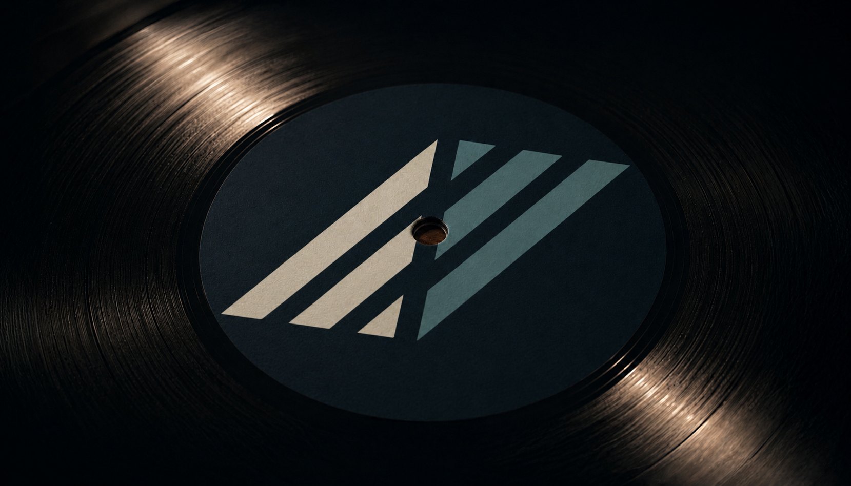
Ireland’s only vinyl pressing plant · 2026
A rebrand for Ireland’s only vinyl pressing plant.
Anthem Vinyl handles the entire physical supply chain — pressing, packaging, fulfilment and retail distribution under one roof. Most pressing services stop at the plant. Anthem doesn’t.
So the identity had to hold on a factory floor and on a record sleeve with equal credibility: precise enough to earn the trust of a label A&R, warm enough for an artist pressing their debut.
Delivered as a complete system — mark, colour, typography, guidelines and asset library — and carried through into the storefront the business now runs on.
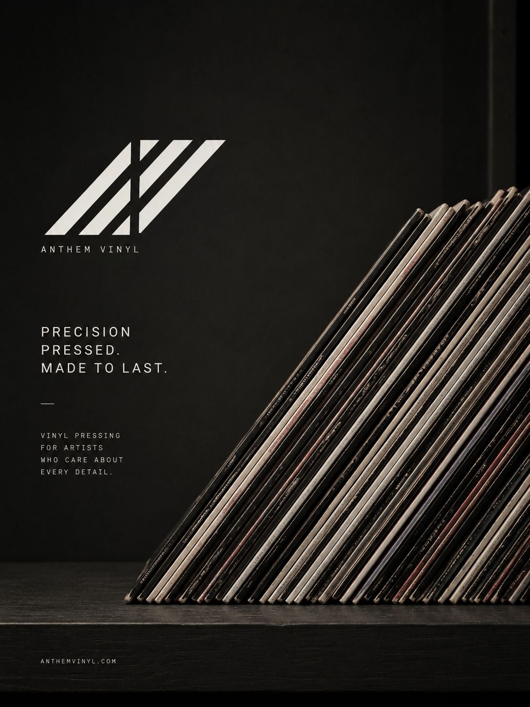
A stack of records, seen from the side.
The mark comes from the way vinyl actually sits in the world — stacked on edge, sleeve spines leaning in a crate, the repeating diagonal of a production line.
Abstracted, those spines resolve into an AV monogram: warm and practical enough to belong to a pressing plant, geometric enough to survive being stamped on a centre label, a mailer or a checkout button.
Two directions were presented, each fully resolved across mark, palette, type and application — a choice between two futures rather than between sketches. The other drew on the curved geometry of an amphitheatre and the arc of a cutting stylus: iconic, characterful, culturally specific. This one won because it scales.
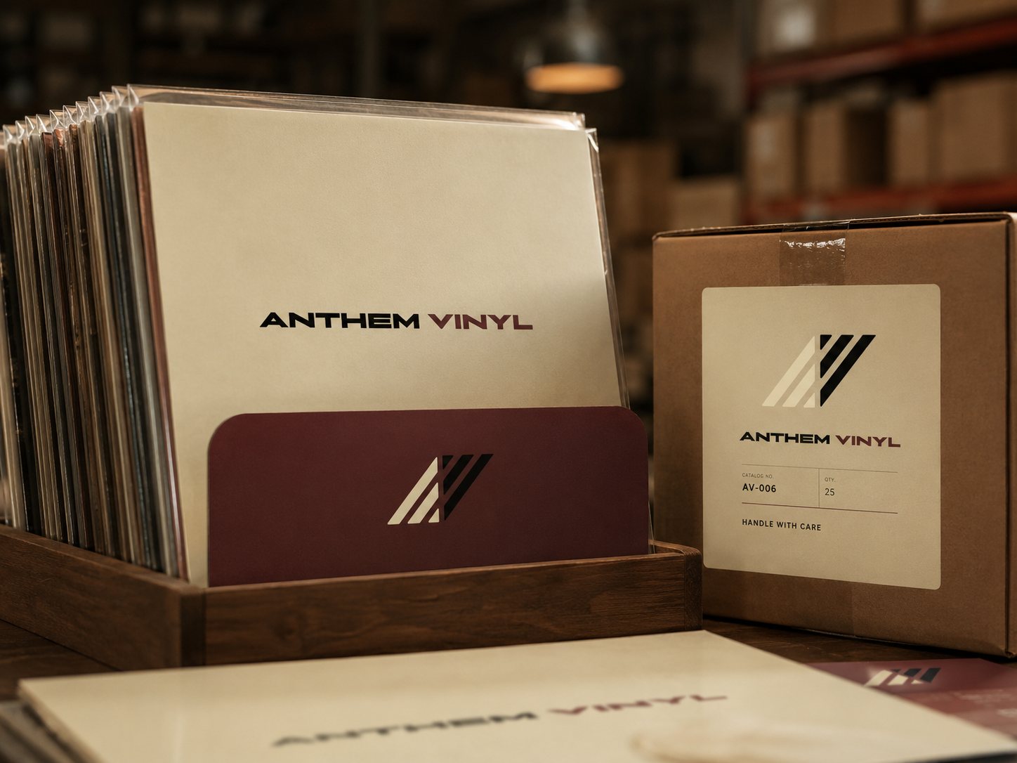
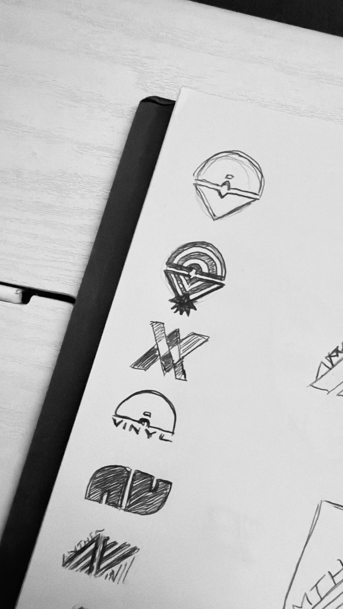

Warm browns and sleeve creams carried the mark through the pitch; the palette was rebuilt for delivery.
Four variants. Each with a job.
A primary mark, a horizontal lockup, a stacked lockup and a wordmark — in colour, light and dark, as SVG and PNG. The guidelines state where each one goes and, just as importantly, where it doesn’t.
The accent colour is reserved exclusively for the mark. It never appears in type, backgrounds or UI. That one rule is what stops an identity drifting once other hands start using it.
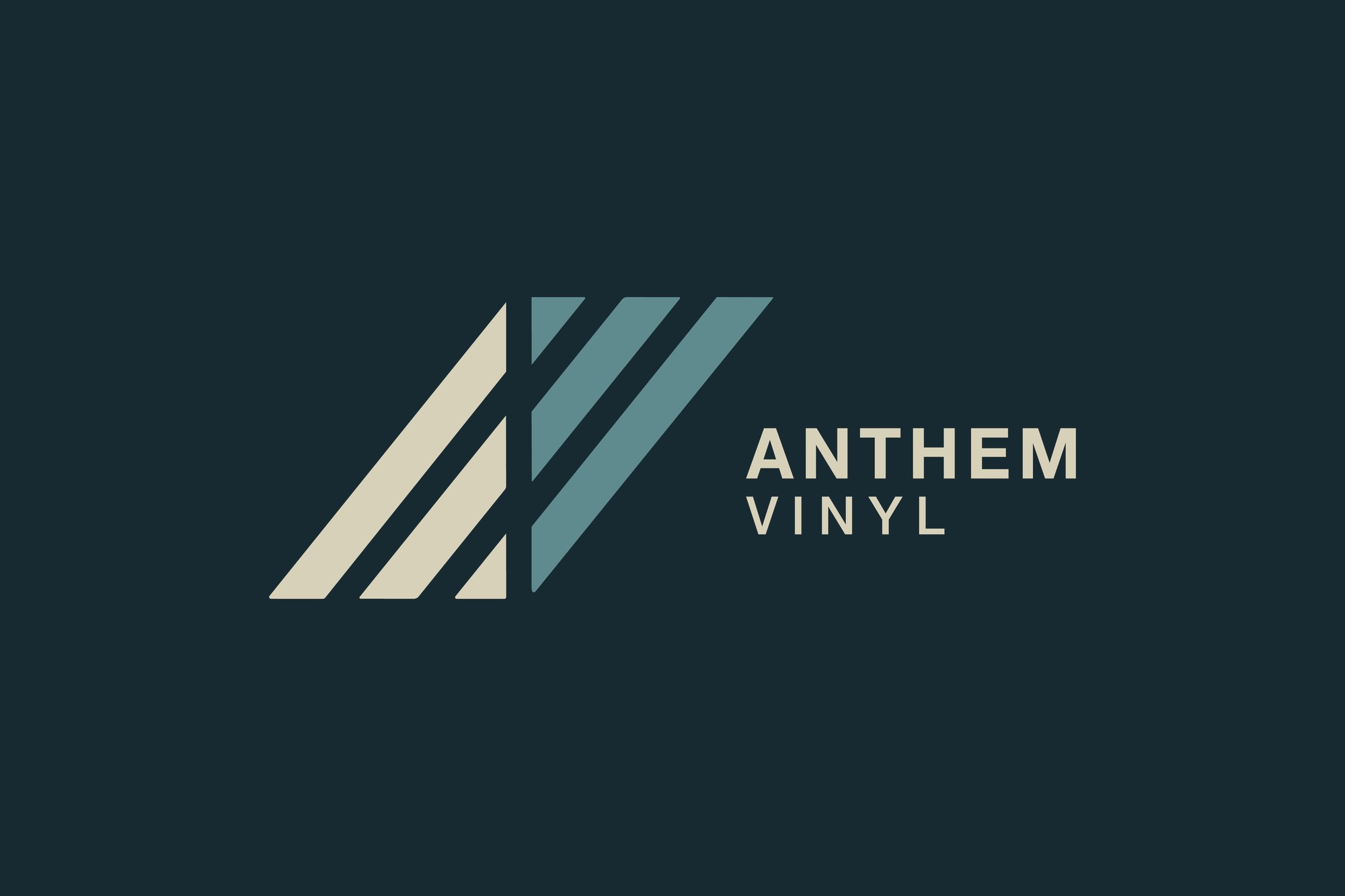
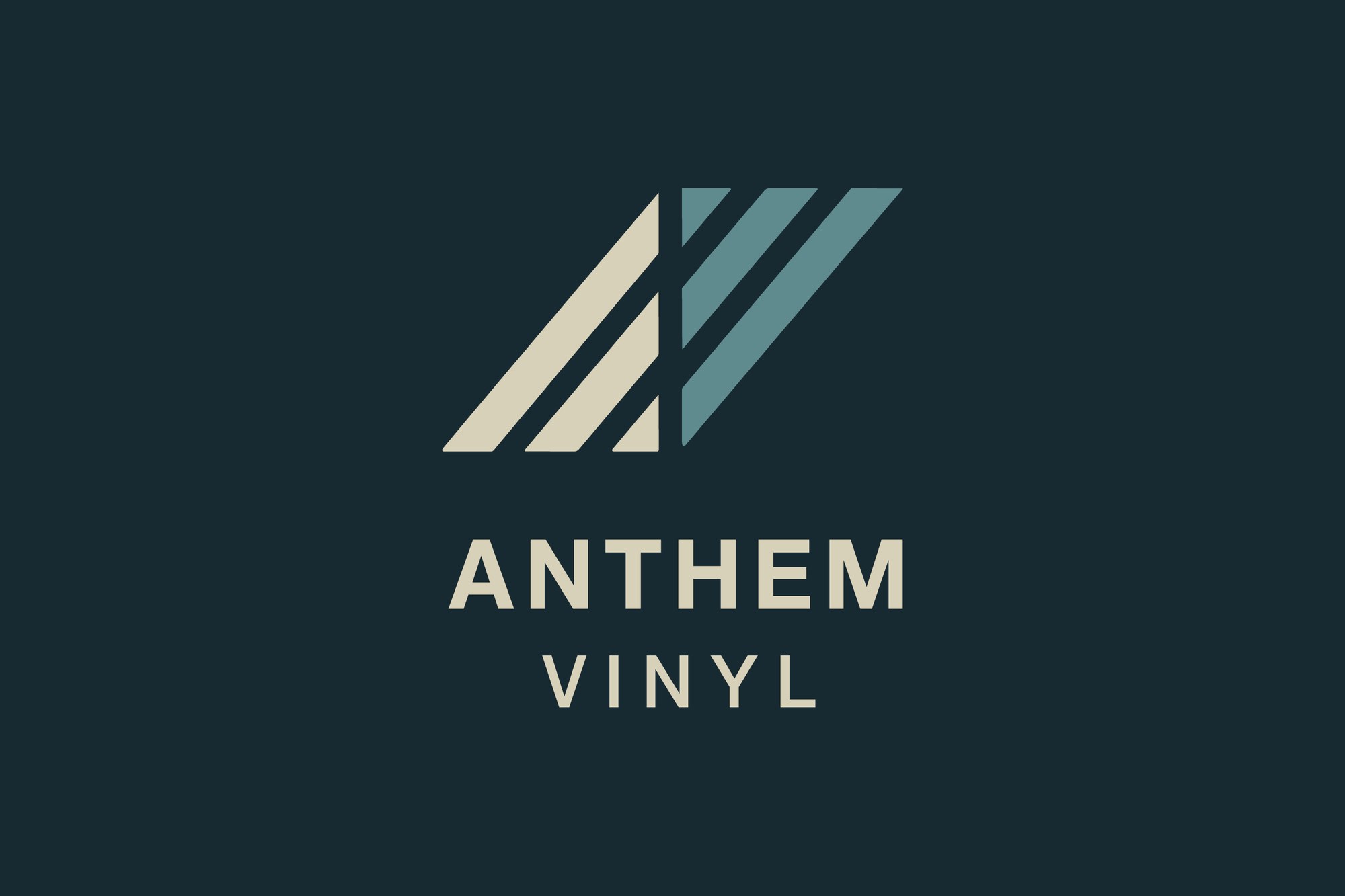
Restrained, physical, industrial.
Six colours, each with a defined role and a documented limit. The palette avoids pure black and pure white so the identity reads as printed matter rather than as a screen.
Every value ships with HEX, RGB, HSB and CMYK, an ink type, a set of CSS custom properties and a Shopify usage map — so the same system holds from a packing label to a checkout button.
On artist storefronts the palette sits behind the artist’s own artwork rather than competing with it.
Two typefaces. One for identity, one for everything else.
Helvetica Neue is the logotype — Bold for ANTHEM, Medium for VINYL, tracked to 100. Acumin Variable carries body copy, labels, captions and buttons across digital and print.
Because Acumin is subscription-bound and Helvetica Neue is licensed, the spec ships with a documented fallback chain — Inter first, DM Sans second — with the web embed, CSS declaration and variable-axis settings written out, and explicit notes on what may and may not be distributed.
A type system nobody can implement is not a type system. The fallbacks are as much the deliverable as the primary.
One system, held across every surface.
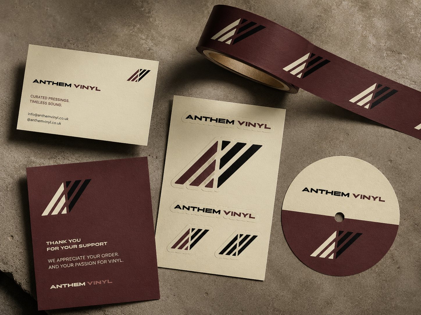
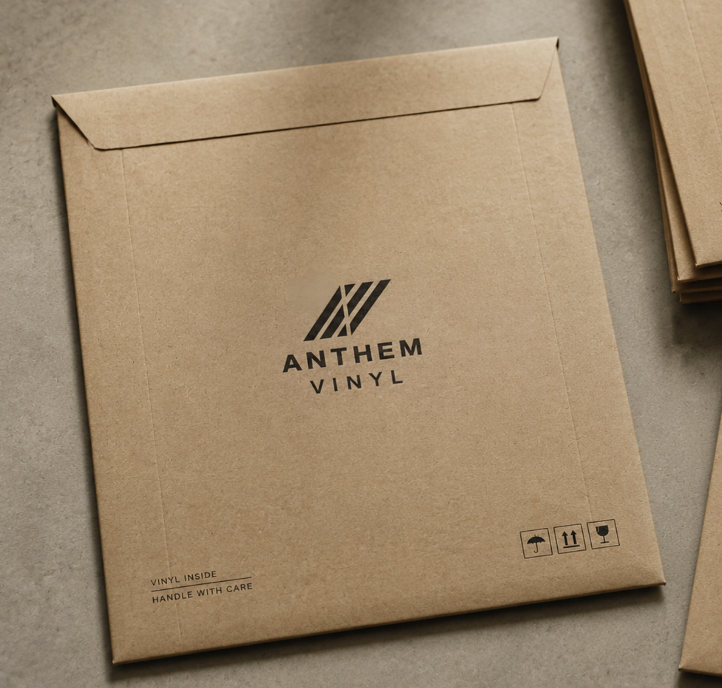
Packaging, mailers, workwear, merchandise and campaign print — the same mark, the same rules, at every scale from a centre label to the back of a shirt on the pressing floor.
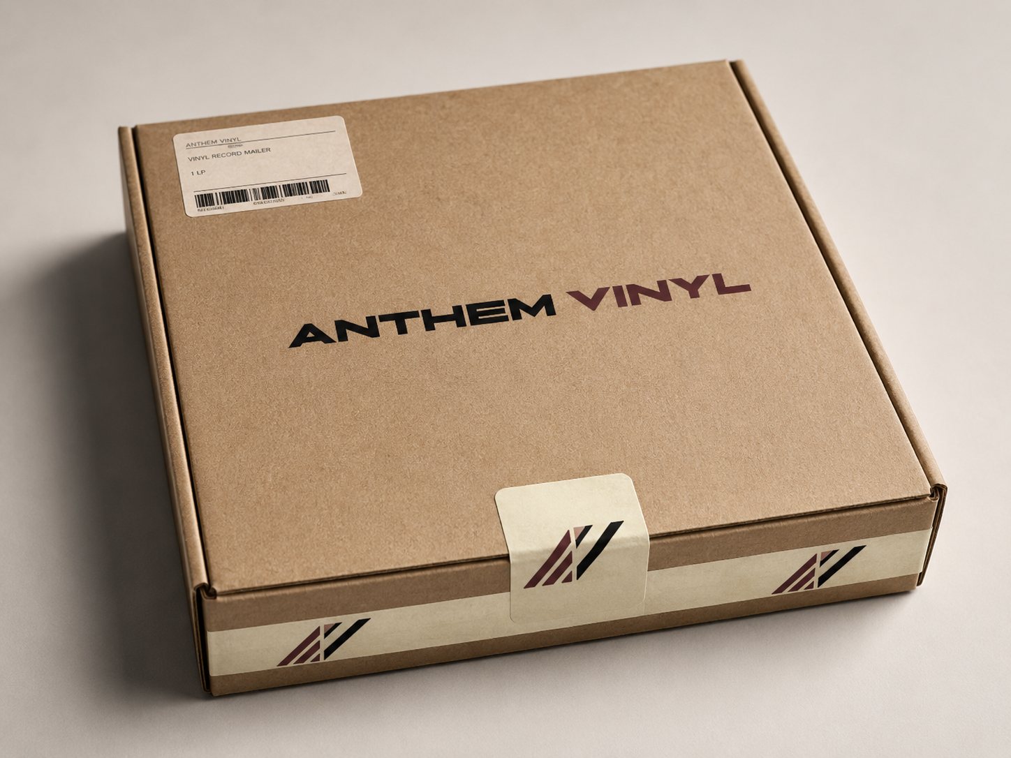
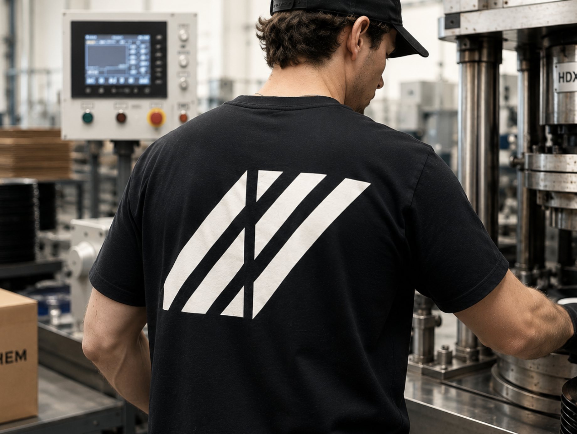
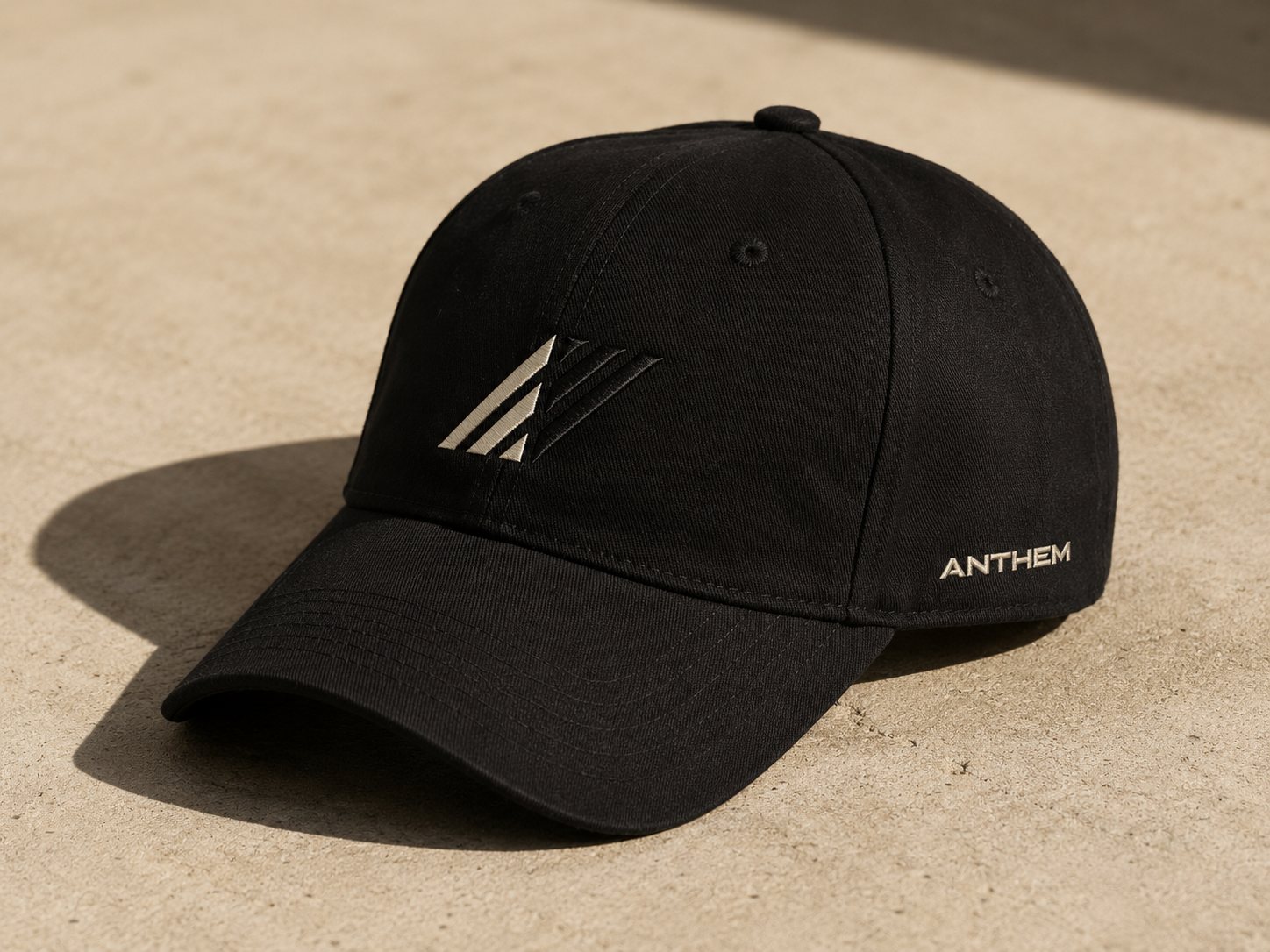
The identity carried straight into the storefront.
The same engagement covered the e-commerce build. Anthem runs as a single Shopify store: one shopfront housing a roster of individual artist stores, sharing one basket and one checkout. Each store is built from a single reusable template, so the roster grows without new development — thirteen artist storefronts are live.
It shipped with the documentation to run it: a brand delivery pack, an artist submission pack and a store management guide. Design that only works while the designer is in the room isn’t finished.
Brand identity, design system and e-commerce build
Delivered through Room Tone
Creative Direction · Brand Identity · Design System · Web Design & Build
Delivered through Room Tone — brand identity, art direction and content for culture, commerce and place.